5.10 数据仪表盘
shiny中制作仪表盘的有两个包:flexdashboard包和shinydashboard包。
| flexdashboard | shinydashboard |
|---|---|
| R Markdown | Shiny |
| Super easy | Not quite as easy |
| Static or dynamic | Dynamic |
| CSS flexbox layout | Bootstrap grid layout |
flexdashboard在rmarkdown中创建仪表盘,并且官网介绍非常清晰明了,上手简单,完全可以现学现用
shinydashboard依旧需要编写一个shiny应用程序
下面的内容着重介绍shinydashboard。
部分细节处可使用HTML和CSS来调整
5.10.1 整体框架
使用dashboardPage()去创建经典的数据看板——顶部标题行,左侧边栏,右侧主板。
当然,你也可以分开创建各个部分,在传递给dashboardPage()
header <- dashboardHeader()

sidebar <- dashboardSidebar()

body <- dashboardBody()

dashboardPage(header, sidebar, body)
5.10.1.1 标题行
如果你不想设置标题行,则dashboardHeader(disable = TRUE)。
标题行除了可以有标题外,直接用dashboardHeader(title = "My Dashboard")赋值,还可以添加下拉菜单。
下拉菜单用dropdownMenu()创建,可以包含消息、通知和任务三种元素。
记得给这三个元素匹配合适的图标
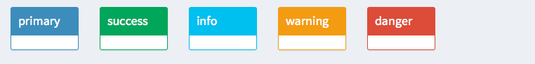
这三种类型的下拉菜单都由dropdownMenu()函数创建,利用参数type指定菜单类型消息message、通知notifications、任务tasks,参数badgeStatus设置小气泡的颜色,然后再由各自的item项来创建具体的条目。
“小气泡”指的是类似手机app右上角显示消息数量的那个小气泡 status设置参加这里
messageItem()from参数表示消息来源,message参数表示消息内容,icon=icon()设置图标,time设置消息时间
icon设置参见这里,默认为“用户形状”
notificationItem()text参数表示通知内容,icon设置图标,status设置通知的颜色taskItem()text参数设置说明性文字,value参数设置任务进度,color设置进度条颜色,href设置超链接
示例如下:
library(shiny)
library(shinydashboard)

header <- dashboardHeader(
  title = "下拉通知菜单",
  dropdownMenu(
    type = "messages",
    badgeStatus = "success",  # 气泡颜色
    messageItem(
      from = "系统通知",
      message = "数据更新已完成",
      time = "10:30"
    ),
    messageItem(
      from = "用户反馈",
      message = "发现新问题",
      icon = icon("file"),
      time = "11:45"
    )
  ),

  dropdownMenu(
    type = "notifications",
    badgeStatus = "danger",  # 气泡颜色
    notificationItem(
      text = "您有新的粉丝"
    )
  ),

  dropdownMenu(
    type = "tasks",
    taskItem(
      text = "工作进度",
      value = 73,
      color = "green"
    )
  )
)

ui <- dashboardPage(
  header,
  dashboardSidebar(),
  dashboardBody())

server <- function(input, output) {
}

shinyApp(ui, server)
当然,这些信息的更新应该是实时的,上面的示例只提供了一个静态的菜单,下面设置动态更新的菜单。
在UI的dashboardHeader()中,直接添加dropdownMenuOutput("ID"),然后再在server处用renderMenu()渲染你要实时更新的菜单内容。
例如
output$messageMenu <- renderMenu({
  # Code to generate each of the messageItems here, in a list. This assumes
  # that messageData is a data frame with two columns, 'from' and 'message'.
  msgs <- apply(messageData, 1, function(row) {
    messageItem(from = row[["from"]], message = row[["message"]])
  })

  # This is equivalent to calling:
  #   dropdownMenu(type="messages", msgs[[1]], msgs[[2]], ...)
  dropdownMenu(type = "messages", .list = msgs)
})
5.10.1.2 侧边栏
如果你不想显示侧边栏,则dashboardSidebar(disable = TRUE)
侧边栏隶属于sidebarMenu(),用menuItem()往里面增加条目。menuItem()的一般用法如下所示:
menuItem(
text, # 菜单项显示的文本(必填)
tabName = NULL, # 关联的tab名称(对应tabItem的tabName)
icon = NULL, # Font Awesome图标(如icon("dashboard"))
badgeLabel = NULL, # 气泡标签(显示在菜单文本右侧)
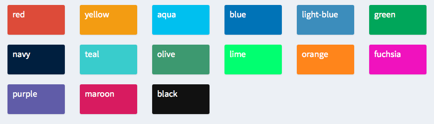
badgeColor = "green", # 气泡颜色("green", "red", "blue"等)
href = NULL, # 外部链接URL(如果设置,会覆盖tabName)
newtab = TRUE, # 是否在新标签页打开外部链接
selected = NULL, # 初始是否选中
expandedName = text, # 展开时显示的文本
startExpanded = FALSE, # 初始是否展开(用于带子菜单的情况)
... # 子菜单项(menuSubItem)
)非常重要的一点,如果该条目没有子条目的话,那么它一定要与对应的tabItem匹配,这样才能将选项与对应的主板页面匹配起来。
在menuItem()中也可继续添加子条目menuSubItem,其用法如下所示:
menuSubItem(
  text,
  tabName = NULL,
  href = NULL,
  newtab = TRUE,
  icon = shiny::icon("angle-double-right"),
  selected = NULL
)对应主板中的内容用tabItems()与tabItem()表示,并用tabName与侧边栏中的选项匹配。如
sidebar <- dashboardSidebar(
  sidebarMenu(
    menuItem("Dashboard", tabName = "dashboard", icon = icon("dashboard")),
    menuItem("Widgets", icon = icon("th"), tabName = "widgets",
             badgeLabel = "new", badgeColor = "green")
  )
)

body <- dashboardBody(
  tabItems(
    tabItem(tabName = "dashboard",
      h2("Dashboard tab content")
    ),

    tabItem(tabName = "widgets",
      h2("Widgets tab content")
    )
  )
)同样,侧边栏菜单及其条目也能动态生成,依靠renderMenu()、sidebarMenuOutput()、menuItemOutput()渲染并输出。
ui <- dashboardPage(
  dashboardHeader(title = "Dynamic sidebar"),
  dashboardSidebar(
    sidebarMenuOutput("menu")
  ),
  dashboardBody()
)

server <- function(input, output) {
  output$menu <- renderMenu({
    sidebarMenu(
      menuItem("Menu item", icon = icon("calendar"))
    )
  })
}

shinyApp(ui, server)
ui <- dashboardPage(
dashboardHeader(title = "Dynamic sidebar"),
dashboardSidebar(
sidebarMenu(
menuItemOutput("menuitem")
)
),
dashboardBody()
)
server <- function(input, output) {
output$menuitem <- renderMenu({
menuItem("Menu item", icon = icon("calendar"))
})
}
shinyApp(ui, server)在侧边栏处,还允许添加shiny的输入组件,以及搜索栏sidebarSearchForm()。
搜索栏技术更加高级,暂且不提
5.10.1.3 主板
关于主板页面的内容,除了之前提到过的tabItems()以及tabItem(),更为理想的布局方式就是将页面划分为一个个方框,每个区域内放置图、表或输入组件。
1. 普通方框
box(
  title = "Box Title",      # 盒子标题
  status = "primary",       # 边框颜色
  bacjground = NULL,        # 背景颜色
  solidHeader = FALSE,      # 是否使用实心头部
  width = 6,                # 宽度(基于Bootstrap网格系统)
  height = NULL,            # 固定高度
  collapsible = FALSE,      # 是否可折叠
  collapsed = FALSE,        # 初始是否为折叠状态
  closable = FALSE,         # 是否可关闭
  footer = NULL,            # 底部内容
  ...,                      # 盒子主体内容
  id = NULL                 # 盒子ID(用于JS操作)
)
例如
dashboardBody(
  fluidRow(
    box(
      title = "Histogram", status = "primary", solidHeader = TRUE,
      collapsible = TRUE,
      plotOutput("plot3", height = 250)
    ),

    box(
      title = "Inputs", status = "warning", solidHeader = TRUE,
      "Box content here", br(), "More box content",
      sliderInput("slider", "Slider input:", 1, 100, 50),
      textInput("text", "Text input:")
    )
  )
)背景色可参考这里
2. 选项卡方框
tabBox()与tabPanel()用来组织方框内各个元素的结构。
tabBox(
  ...,                        # tabPanel()元素
  id = NULL,
  selected = NULL,
  title = NULL,
  width = 6,
  height = NULL,
  side = c("left", "right")
)

tabPanel(
  id = NULL
  title,       # 选项卡标题
  ...,         # 选项卡内容
  icon = NULL  # Font Awesome图标(如 icon("chart-bar"))
)
library(shiny)
library(shinydashboard)
body <- dashboardBody(
fluidRow(
tabBox(
title = "First tabBox",
# The id lets us use input$tabset1 on the server to find the current tab
id = "tabset1", height = "250px",
tabPanel("Tab1", "First tab content"),
tabPanel("Tab2", "Tab content 2")
),
tabBox(
side = "right", height = "250px", # side="right"表示从右往左放
selected = "Tab3",
tabPanel("Tab1", "Tab content 1"),
tabPanel("Tab2", "Tab content 2"),
tabPanel("Tab3", "Note that when side=right, the tab order is reversed.")
)
),
fluidRow(
tabBox(
# Title can include an icon
title = tagList(shiny::icon("gear"), "tabBox status"),
tabPanel("Tab1",
"Currently selected tab from first box:",
verbatimTextOutput("tabset1Selected")
),
tabPanel("Tab2", "Tab content 2")
)
)
)
shinyApp(
ui = dashboardPage(
dashboardHeader(title = "tabBoxes"),
dashboardSidebar(),
body
),
server = function(input, output) {
# The currently selected tab from the first box
output$tabset1Selected <- renderText({
input$tabset1
})
}
)小技巧:可用
tagList()来拼接图标和文本
3. 信息方框
类似一个方框里面,加个图标,加个说明性文本,加个指标。
infoBox(
  title,
  value = NULL,
  subtitle = NULL,
  icon = shiny::icon("bar-chart"),
  color = "aqua",
  width = 4,
  href = NULL,
  fill = FALSE    # 是否填充方框
)
library(shiny)
library(shinydashboard)
ui <- dashboardPage(
dashboardHeader(title = "Info boxes"),
dashboardSidebar(),
dashboardBody(
# infoBoxes with fill=FALSE
fluidRow(
# A static infoBox
infoBox("New Orders", 10 * 2, icon = icon("credit-card")),
# Dynamic infoBoxes
infoBoxOutput("progressBox"),
infoBoxOutput("approvalBox")
),
# infoBoxes with fill=TRUE
fluidRow(
infoBox("New Orders", 10 * 2, icon = icon("credit-card"), fill = TRUE),
infoBoxOutput("progressBox2"),
infoBoxOutput("approvalBox2")
),
fluidRow(
# Clicking this will increment the progress amount
box(width = 4, actionButton("count", "Increment progress"))
)
)
)
server <- function(input, output) {
output$progressBox <- renderInfoBox({
infoBox(
"Progress", paste0(25 + input$count, "%"), icon = icon("list"),
color = "purple"
)
})
output$approvalBox <- renderInfoBox({
infoBox(
"Approval", "80%", icon = icon("thumbs-up", lib = "glyphicon"),
color = "yellow"
)
})
# Same as above, but with fill=TRUE
output$progressBox2 <- renderInfoBox({
infoBox(
"Progress", paste0(25 + input$count, "%"), icon = icon("list"),
color = "purple", fill = TRUE
)
})
output$approvalBox2 <- renderInfoBox({
infoBox(
"Approval", "80%", icon = icon("thumbs-up", lib = "glyphicon"),
color = "yellow", fill = TRUE
)
})
}
shinyApp(ui, server)4. 数值方框
数值方框和信息方框类似,都是在小方块中有图标、有指标、有文本,都能设置成静态的或者动态的。
个人感觉,数值方框相较信息方框从视觉上凸显了“指标”
library(shiny)
library(shinydashboard)

ui <- dashboardPage(
  dashboardHeader(title = "Value boxes"),
  dashboardSidebar(),
  dashboardBody(
    fluidRow(
      # A static valueBox
      valueBox(10 * 2, "New Orders", icon = icon("credit-card")),

      # Dynamic valueBoxes
      valueBoxOutput("progressBox"),

      valueBoxOutput("approvalBox")
    ),
    fluidRow(
      # Clicking this will increment the progress amount
      box(width = 4, actionButton("count", "Increment progress"))
    )
  )
)

server <- function(input, output) {
  output$progressBox <- renderValueBox({
    valueBox(
      paste0(25 + input$count, "%"), "Progress", icon = icon("list"),
      color = "purple"
    )
  })

  output$approvalBox <- renderValueBox({
    valueBox(
      "80%", "Approval", icon = icon("thumbs-up", lib = "glyphicon"),
      color = "yellow"
    )
  })
}

shinyApp(ui, server)
5. 布局
基于行的布局
使用
fluidRow()来组织每一行的内容。注意宽度为12个单位,每个方框的默认宽度为6。基于行的布局默认每行内容顶部对齐,因此底部不一定对齐,取决于各个元素的内容。在
box()中可设置height来统一高度。
宽度
width是基于bootstrap的12单位宽,而高度height的单位是像素
基于列的布局
在
fluidRow()内部使用column()来划分出一列,column()内的box()将会从上到下排列。由于
column()中指定了宽度width,故box()的宽度得设置为width=NULL,统一使用column()的宽度。
fluidRow(
    column(width = 6,
      box(
        title = "Box title", width = NULL, status = "primary",
        "Box content"
      ),
      box(
        title = "Title 1", width = NULL, solidHeader = TRUE, status = "primary",
        "Box content"
      ),
      box(
        width = NULL, background = "black",
        "A box with a solid black background"
      )
    ),

    column(width = 6,
      box(
        status = "warning", width = NULL,
        "Box content"
      ),
      box(
        title = "Title 3", width = NULL, solidHeader = TRUE, status = "warning",
        "Box content"
      ),
      box(
        title = "Title 5", width = NULL, background = "light-blue",
        "A box with a solid light-blue background"
      )
    )
行列混合布局
由于列布局是在
fluidRow()中加入column()实现,因此,布局的基本单位就是行视角。基于此,就可以任意实现行与列混合布局。
5.10.2 外观
5.10.2.2 CSS样式
在shiny应用所在的目录中创建名为www的新文件夹,再在里面创建css文件,文件中的内容就是你自定义的css样式。
之后在dashboardBody处引用这个css文件即可。
示例如下:
.main-header .logo {
  font-family: "Georgia", Times, "Times New Roman", serif;
  font-weight: bold;
  font-size: 24px;
}
dashboardPage(
dashboardHeader(title = "Custom font"),
dashboardSidebar(),
dashboardBody(
tags$head(
tags$link(rel = "stylesheet", type = "text/css", href = "custom.css")
)
)
)注意在shiny所在的目录中新建
www文件夹,该文件夹内包含custom.css文件
或者直接在shiny中输入html语言。
dashboardPage(
  dashboardHeader(title = "Custom font"),
  dashboardSidebar(),
  dashboardBody(
    tags$head(tags$style(HTML('
      .main-header .logo {
        font-family: "Georgia", Times, "Times New Roman", serif;
        font-weight: bold;
        font-size: 24px;
      }
    ')))
  )
)其余方式详见此处
5.10.2.3 标题宽度
在dashboardHeader()中设置参数titleWidth来调整宽度,单位为像素。同时,也可设置标题处的背景色与标题行的背景色相同。
dashboardPage(
    dashboardHeader(
      title = "Example of a long title that needs more space",
      titleWidth = 450
    ),
    dashboardSidebar(),
    dashboardBody(
      # Also add some custom CSS to make the title background area the same
      # color as the rest of the header.
      tags$head(tags$style(HTML('
        .skin-blue .main-header .logo {
          background-color: #3c8dbc;
        }
        .skin-blue .main-header .logo:hover {
          background-color: #3c8dbc;
        }
      ')))
    )
)5.10.2.5 图标
不少函数中有参数icon,你可用icon()来传递对应的图标,如icon = icon('calendar')。
icon()默认使用FontAwesome的图标,也可用参数lib更改来源,使用Glyphicon的图标。
5.10.3 案例
数据生成部分:
library(tidyverse)
library(hms)

# 用户信息
gen_customers <- function(user_id_start, num, date){
  # id_start表示从哪个id开始计数
  # num表示要生成的用户数
  # date表示今日日期

  province <- c("北京", "天津", "河北", "山西", "内蒙古",
                "辽宁", "吉林", "黑龙江",
                "上海", "江苏", "浙江", "安徽", "福建", "江西", "山东",
                "河南", "湖北", "湖南", "广东", "广西", "海南",
                "重庆", "四川", "贵州", "云南", "西藏",
                "陕西", "甘肃", "青海", "宁夏", "新疆")

  reg_times <- hms::hms(
    seconds = sample(0:59, num, replace = TRUE),
    minutes = sample(0:59, num, replace = TRUE),
    hours = pmin(pmax(round(rnorm(num, mean = 14, sd = 5)), 0), 23)
  )

  age_prob <- runif(length(18:55))
  age_prob <- age_prob/sum(age_prob)

  gender_prob <- runif(2)
  gender_prob <- gender_prob/sum(gender_prob)

  province_prob <- runif(31)
  province_prob <- province_prob/sum(province_prob)

  customers <- tibble(
    reg_date = rep(date, num),
    reg_time = reg_times,
    age = sample(18:55, num, replace = TRUE, prob = age_prob),
    gender = sample(c("男","女"), num, replace = TRUE, prob = gender_prob),
    province = sample(province, num, replace = TRUE, prob = province_prob)
  ) %>%
    arrange(reg_time) %>%
    mutate(id = (user_id_start):(user_id_start+num-1)) %>%
    relocate(id, .before = reg_date)

  return(customers)
}

# 商品信息
df_products <- tibble(
  product_id = 1:20,
  category = rep(c("A", "B", "C", "D", "E"),
                 times = c(8,3,4,3,2)),
  item = c(1:8, 1:3, 1:4, 1:3, 1:2),
  price = round(runif(20, 10, 500)),
  cost = round(price * runif(20, 0.4, 0.7)),
  original_stock = round(rnorm(20, 500, 5)),
  new_stock = original_stock
)

# 订单信息
gen_order <- function(order_id_start, user_id, date, df_customers){
  # 生成每笔订单的购物信息

  reg_date <- df_customers[df_customers$id == user_id,][["reg_date"]]
  if(reg_date != date){
    order_time <- hms::hms(
      seconds = sample(0:59, 1, replace = TRUE),
      minutes = sample(0:59, 1, replace = TRUE),
      hours = pmin(pmax(round(rnorm(1, mean = 14, sd = 5)), 0), 23)
    )
  }else{
    reg_time <- df_customers[df_customers$id == user_id,][["reg_time"]]
    sec <- sample(0:(2*60*60), 1)   # 2小时内下单
    order_time <- as_hms(reg_time + hms(seconds = min(sec, 86399)))
  }

  purchase_product <- sample(1:20, sample(1:3, 1, prob = c(0.8,0.15,0.05)))
  purchase_num <- sample(1:4, length(purchase_product), replace = TRUE, prob = c(0.7,0.15,0.1,0.05))

  df_order <- tibble(
    order_id = order_id_start,
    user_id = user_id,
    date = date,
    time = order_time,
    product = purchase_product,
    num = purchase_num
  )

  return(df_order)
}shiny部分:
library(tidyverse)
library(shiny)
library(shinydashboard)
library(shinyWidgets)
library(bubbles)
library(plotly)
source('E:/R/shiny/demo/gen_data.R')

header <- dashboardHeader(
  title = 'Demo',
  dropdownMenuOutput('update_notification'),
  tags$li(
    class = "dropdown date-center",
    textOutput("current_date")
  )
)

sidebar <- dashboardSidebar(
  sidebarMenu(
    menuItem("核 心 指 标", tabName = "kpi", icon = icon("table")),
    menuItem("用 户 分 析", tabName = "users", icon = icon("user")),
    menuItem('商 品 分 析', tabName = 'products', icon = icon("cart-shopping")),
    menuItem("设 置", tabName = "setting", icon = icon("gear"),
             menuSubItem(actionButton("manual_update", "手动更新", icon = icon("sync"))),
             menuSubItem(
               materialSwitch(
                 inputId = "auto_update",
                 label = '自动更新',
                 value = FALSE,
                 status = 'success',
                 inline = TRUE
               )
             ))
    )
  )

body <- dashboardBody(
  tags$head(
    tags$style(HTML("
        /* 日期居中样式 */
        .date-center {
          position: absolute !important;
          left: 0 !important;
          right: 0 !important;
          top: 0 !important;
          text-align: center !important;
          padding-top: 10px !important;
          pointer-events: none;  /* 防止遮挡其他元素 */
        }

        /* 隐藏默认标题 */
        .main-header .navbar-custom-menu,
        .main-header .sidebar-toggle {
          z-index: 1;  /* 确保其他元素在前 */
        }

        /* 文本样式 */
        #current_date {
          color: white;
          font-weight: bold;
          font-size: 24px;
        }
      "))
  ),
  tabItems(
    # 核心指标
    tabItem(
      tabName = 'kpi',
      fluidRow(
        valueBoxOutput('gmv', width = 3),
        valueBoxOutput('volume', width = 3),
        valueBoxOutput('users', width = 3),
        valueBoxOutput('reg_users', width = 3)
      ),
      fluidRow(
        column(width = 4, offset = 2,
               sliderInput("date_range", "日期范围:",
                             min = Sys.Date(),
                             max = Sys.Date(),
                             value = c(Sys.Date(), Sys.Date()),
                             timeFormat = "%Y-%m-%d")),
        column(width = 4,
               selectInput('selected_idx',
                             label = '指标',
                             choices = c('历史销售额','历史销量','历史新增用户'),
                             selected = '历史销售额'))
      ),
      fluidRow(
        box(status = "primary", plotlyOutput('kpi_plot'), width = 12)
      )
    ),

    tabItem(
      tabName = 'users',
      fluidRow(
        # column里的元素(这里是box)的宽度12是相对该column而言的,而非整个屏幕
        column(width = 4,
               box(
                 status = 'primary', width = 12,
                 plotlyOutput('user_frequency_plot')
               )
               ),
        column(width = 4,
               box(
                 status = 'primary', width = 12,
                 div(
                   textOutput('bin_width'),
                   style = "font-size: 15px;"),
                 plotlyOutput('user_mean_amount_plot')
               )
               ),
        column(width = 4,
               box(
                 status = 'primary', width = 12,
                 plotlyOutput('user_total_amount_plot')
               ))
      ),
      fluidRow()
    ),

    tabItem(
      tabName = 'products',
      fluidRow(
        column(width=6,
               box(
                 title = '今日销售商品构成',
                 status = 'primary', width = 12,
                 plotlyOutput('product_num_plot')
               ),
               box(
                 title = '商品库存',
                 status = 'primary', width = 12,
                 plotlyOutput('product_stock_plot')
               )
        ),
        column(width=6,
               box(
                 title = '今日商品销售金额',
                 status = 'primary', width = 12,
                 bubblesOutput('product_amount_plot', height = '800px')
               )
        )
      )
    )
  )
)

ui <- dashboardPage(header, sidebar, body)

server <- function(input, output) {
  # 存储所有用户数据
  df_customers <- reactiveVal(tibble())

  # 存储订单数据
  df_orders <- reactiveVal(tibble())

  # 商品信息
  df_products <- reactiveVal(df_products)

  # 库存检测
  stock_observe <- reactiveVal(TRUE)

  # kpi指标
  idx_gmv <- reactiveVal(0)
  idx_volume <- reactiveVal(0)
  idx_users <- reactiveVal(0)
  idx_reg_users <- reactiveVal(0)
  df_kpi <- reactiveVal(tibble())

  # 存储更新时间
  update_time <- reactiveVal(character(0))

  # 当前日期(随时间动态更新)
  current_date <- reactiveVal(Sys.Date())

  # 响应式获取用户ID与订单ID
  next_user_id <- reactive({
    if(nrow(df_customers()) != 0) {
      max(df_customers()$id) + 1
    } else {
      1
    }
  })

  next_order_id <- reactive({
    if(nrow(df_orders()) != 0) {
      max(df_orders()$order_id) + 1
    } else {
      1
    }
  })

  # 更新数据
  update_data <- function() {
    isolate({
      # 获取当前用户数据
      current_users <- df_customers()
      # 获取下一个可用用户ID
      next_user_id_val <- next_user_id()
      # 获取当前日期
      current_date_val <- current_date()
      # 获取当前订单数据
      current_orders <- df_orders()
      # 获取下一个订单ID
      next_order_id_val <- next_order_id()
      # 获取产品数据
      products_data <- df_products()
      # 获取kpi数据框
      current_kpi <- df_kpi()
    })
    # 随机生成用户数量
    num <- sample(10:50, 1)

    # 生成新用户
    new_customers <- gen_customers(
      user_id_start = next_user_id_val,
      num = num,
      date = current_date_val
    )
    update_customers <- bind_rows(current_users, new_customers)

    # 生成新订单
    consumers_num <- round(rnorm(1, mean=nrow(update_customers)*0.3, sd=nrow(update_customers)/20))
    consumers_id <- sample(1:nrow(update_customers), pmax(consumers_num, 1)) %>% as.list()
    order_id <- as.list(next_order_id_val:(next_order_id_val+length(consumers_id)-1))
    new_orders <- map2(order_id, consumers_id, ~gen_order(.x, .y, current_date_val, update_customers)) %>% do.call(rbind, .)
    new_orders$amount <- products_data$price[new_orders$product] * new_orders$num
    update_orders <- bind_rows(current_orders, new_orders)

    # 销售额
    gmv <- sum(new_orders$amount)
    # 销量
    volume <- sum(new_orders$num)
    # 总用户数
    users <- nrow(update_customers)
    # 新增用户数
    reg_users <- nrow(new_customers)
    update_kpi <- tibble(
      idx = c('销售额','销量','新增用户数'),
      date = current_date_val,
      val = c(gmv, volume, reg_users)
    )
    update_kpi <- rbind(current_kpi, update_kpi)

    # 修改库存
    change_num <- new_orders %>%
      group_by(product) %>%
      summarise(n=sum(num))
    products_data$new_stock[change_num$product] <- products_data$new_stock[change_num$product] - change_num$n
    new_stock_observe <- any(products_data$new_stock <=100)

    isolate({
      # 更新用户数据集
      df_customers(update_customers)

      # 更新订单数据集
      df_orders(update_orders)

      # 更新库存
      df_products(products_data)
      stock_observe(!new_stock_observe)

      # 更新KPI
      idx_gmv(gmv)
      idx_volume(volume)
      idx_users(users)
      idx_reg_users(reg_users)
      df_kpi(update_kpi)

      # 更新日期
      current_date(current_date() + 1)

      # 记录更新时间
      new_time <- format(Sys.time(), "%H:%M:%S")
      update_time(new_time)

      output$update_notification <- renderMenu({
        dropdownMenu(
          type = "notifications",
          notificationItem(
            icon = icon("rotate"),
            text = paste("最后更新:", update_time()),
            status = "success"
          )
        )
      })
    })

  }

  # 自动更新
  observe({
    # 设置定时器
    on.exit(invalidateLater(2000), add = TRUE)
    if(input$auto_update){
      if(isolate(stock_observe())){
        update_data()

        # 更新滑块的最大值和结束日期
        isolate({
          updateSliderInput(
            inputId = "date_range",
            max = current_date(),
            value = c(input$date_range[1], current_date())
          )
        })
      }else{
        showNotification('库存不足,停止更新!', duration = NULL, closeButton = TRUE)
      }
    }
  })

  # 手动更新
  observeEvent(input$manual_update, {
    if(isolate(stock_observe())){
      update_data()
      # 更新滑块的最大值和结束日期
      updateSliderInput(
        inputId = "date_range",
        max = max(input$date_range[2], current_date()),
        value = c(input$date_range[1], current_date())
      )
    }else{
      showNotification('库存不足,停止更新!', duration = NULL, closeButton = TRUE)
    }
  })

  output$gmv <- renderValueBox({
    valueBox(
      value = idx_gmv(),
      subtitle = '今日销售额',
      icon = icon('yen-sign'),
      color = 'fuchsia'
    )
  })

  output$volume <- renderValueBox({
    valueBox(
      value = idx_volume(),
      subtitle = '今日销量',
      icon = icon('coins'),
      color = 'orange'
    )
  })

  output$users <- renderValueBox({
    valueBox(
      value = idx_users(),
      subtitle = '总用户数',
      icon = icon('users'),
      color = 'aqua'
    )
  })

  output$reg_users <- renderValueBox({
    valueBox(
      value = idx_reg_users(),
      subtitle = '今日注册用户数',
      icon = icon('registered'),
      color = 'purple'
    )
  })

  output$current_date <- renderText({
    format(current_date(), "%Y年%m月%d日")
  })

  output$kpi_plot <- renderPlotly({
    if(nrow(df_kpi())>0){
      selected_idx <- switch(input$selected_idx,
                             '历史销售额' = '销售额',
                             '历史销量' = '销量',
                             '历史新增用户' = '新增用户数')

      df <- df_kpi() %>%
        filter(idx == selected_idx, date>=input$date_range[1] & date <= input$date_range[2]) %>%
        arrange(date)
      p <- ggplot(df)+
        geom_line(aes(x=date, y=val, color = idx, group = idx))+
        geom_point(aes(x=date, y=val), color = 'black')+
        theme_bw()+
        labs(x='日期', y='')+
        scale_x_date(date_labels = '%Y-%m-%d')+
        theme(legend.position = 'none')
      ggplotly(p) %>%
        layout(
          hoverlabel = list(
            bgcolor = "white",
            font = list(size = 12, color = "black")
          )
        )
    }
  })

  output$user_frequency_plot <- renderPlotly({
    if(nrow(df_orders())>0){
      df <- df_orders()
      df <- df %>%
        group_by(user_id) %>%
        summarise(num=length(unique(order_id)), mean_amount = mean(amount), total_amount = sum(amount)) %>%
        dplyr::ungroup()

      p <- ggplot(df)+
        geom_bar(aes(x=num), fill = '#1E90FF', color = 'black')+
        theme_bw()+
        labs(x='消费次数', y='')+
        scale_x_continuous(breaks=scales::breaks_width(1))

      ggplotly(p) %>%
        layout(
          hoverlabel = list(
            bgcolor = "white",
            font = list(size = 12, color = "black")
          )
        )
    }
  })

  output$bin_width <- renderText({
    if(nrow(df_orders())>0){
      df <- df_orders()
      df <- df %>%
        group_by(user_id) %>%
        summarise(num=length(unique(order_id)), mean_amount = mean(amount), total_amount = sum(amount)) %>%
        dplyr::ungroup()

      bin_width <- round(3.49 * sd(df$mean_amount) / nrow(df)^(1/3))

      paste0('bin宽度:', bin_width)
    }
  })
  output$user_mean_amount_plot <- renderPlotly({
    if(nrow(df_orders())>0){
      df <- df_orders()
      df <- df %>%
        group_by(user_id) %>%
        summarise(num=length(unique(order_id)), mean_amount = mean(amount), total_amount = sum(amount)) %>%
        dplyr::ungroup()

      bin_width <- round(3.49 * sd(df$mean_amount) / nrow(df)^(1/3))
      p <- ggplot(df)+
        geom_histogram(aes(x=mean_amount), fill = '#1E90FF', color = 'black',
                       binwidth = bin_width )+
        theme_bw()+
        labs(x='平均消费金额', y='')

      ggplotly(p) %>%
        layout(
          hoverlabel = list(
            bgcolor = "white",
            font = list(size = 12, color = "black")
          )
        )
    }
  })

  output$user_total_amount_plot <- renderPlotly({
    if(nrow(df_orders())>0){
      df <- df_orders()
      df <- df %>%
        group_by(user_id) %>%
        summarise(num=length(unique(order_id)), mean_amount = mean(amount), total_amount = sum(amount)) %>%
        dplyr::ungroup() %>%
        slice_max(total_amount, n=10) %>%
        mutate(user_id = factor(user_id)) %>%
        mutate(user_id = fct_reorder(user_id, total_amount))

      hover_text <- paste("ID:", df$user_id, "<br>",
                          "total_amount:", scales::comma(df$total_amount), "<br>")

      # 创建基础ggplot对象
      p <- ggplot(df) +
        geom_bar(
          aes(x = total_amount, y = user_id),
          fill = '#1E90FF', color = 'black', stat = 'identity'
        ) +
        theme_bw() +
        labs(x = '总消费金额', y = '用户id')

      # 在ggplotly中使用自定义悬停文本
      ggplotly(p, tooltip = "none") %>%  # 禁用默认提示
        style(
          text = hover_text,  # 设置自定义悬停文本
          hoverinfo = "text", # 仅显示文本
          traces = 1          # 应用到第一个轨迹(条形图)
        ) %>%
        layout(
          hoverlabel = list(
            bgcolor = "white",
            font = list(size = 12, color = "black")
          )
        )
    }
  })

  output$product_num_plot <- renderPlotly({
    if(nrow(df_orders())>0){
      df <- df_orders()
      df$name <- paste0(df_products()$category, df_products()$item)[df$product]

      plot_ly(df, labels=~name, values=~num, type='pie')
    }
  })

  output$product_amount_plot <- renderBubbles({
    if(nrow(df_orders())>0){
      df <- df_orders()
      df$name <- paste0(df_products()$category, df_products()$item)[df$product]
      df <- df %>%
        dplyr::group_by(name) %>%
        summarise(total_amount = sum(amount)) %>%
        dplyr::ungroup()

      bubbles(df$total_amount, df$name, tooltip = paste0(df$name, ':',df$total_amount), height = '100%')
    }
  })

  output$product_stock_plot <- renderPlotly({
    df <- df_products()
    df$name <- paste0(df$category, df$item)
    p <- ggplot(df)+
      geom_segment(aes(x=new_stock, xend=original_stock, y=name, yend=name))+
      geom_point(aes(x=new_stock, y=name), color = 'red')+
      geom_point(aes(x=original_stock, y=name), color = 'blue')+
      theme_bw()+
      labs(x='库存', y='')
    ggplotly(p)
  })

}

shinyApp(ui, server)
Tips:
必要时可以用HTML来增添细节。
fluidRow()中的column()具有独立的空间,其内部的元素的宽度都是相对column()而言的(即对于内部元素而言column的宽度就是12),而非整个屏幕。建议将用到的反应式变量集中在一块,方便同一调度。
在
observe()内部,会监测任一反应式变量(包括动态ui组件)的变化,如果有更新,则会重新执行代码块。注意,如果存在重复调度的情况,则会陷入无限循环,典型表现就是生成shiny应用时屏幕泛白。为了避免此类情况,若在observe()内部需要重复调用反应式变量,建议用isolate()将其隔离,转化为本地变量后,再用isolate()更新反应式变量。